
FTDNA Design System
Overview
FamilyTreeDNA didn’t have a standardized User Interface (UI) defined, making it difficult to scale designs and make consistent and maintainable updates across all 20+ products. Effective design processes and solutions were almost impossible to execute, resulting in heavy design and technical debt.
The challenge
Define a cohesive design language for designers and developers to work from.
Create a single source of truth for all existing FamilyTreeDNA components.
Speed up the design and development process with a set of components and pattern libraries teams can use to create and test products faster.
Improve brand consistency across all FamilyTreeDNA apps.
Customized Angular Material Theme and Components.
THE TEAM
Monique D - Art Director
Lori L - UX Designer
Will L - Sr UX Designer
James G - Engineer
MY ROLE
Lead Designer, Research, User Interface, Documentation, Facilitator, and Development.
TOOLS USED
Confluence, Adobe XD, Angular Material, GitHub
⛵ Design system discovery
Auditing the visual attributes
I used a tool (CSS Stats) recommended by Brad Frost in his book Atomic Design to see the number of declarations, rules, properties, and selectors in the style sheets. Also to know about the overall colors, font sizes, and font families.

FamilyTreeDNA overview found by CSS Stats.

FamilyTreeDNA 166 unique colors found by CSS Stats.
Researching other systems
After going over the visual inventory following some of the Brad Frost methodologies, the team and I performed a UI checklist to look at the current components across the apps, like buttons, dropdowns, forms, tables, cards, dialogs (modals), and more.
As part of the process, we decided to research other design systems like IBM (Carbon Design), Atlassian, and Sales Force (Lighting Design System) for component best practices and inspiration.

Salesforce - Lighting Design System

Atlassian - Design System

IBM - Carbon Design System
Creating an inventory
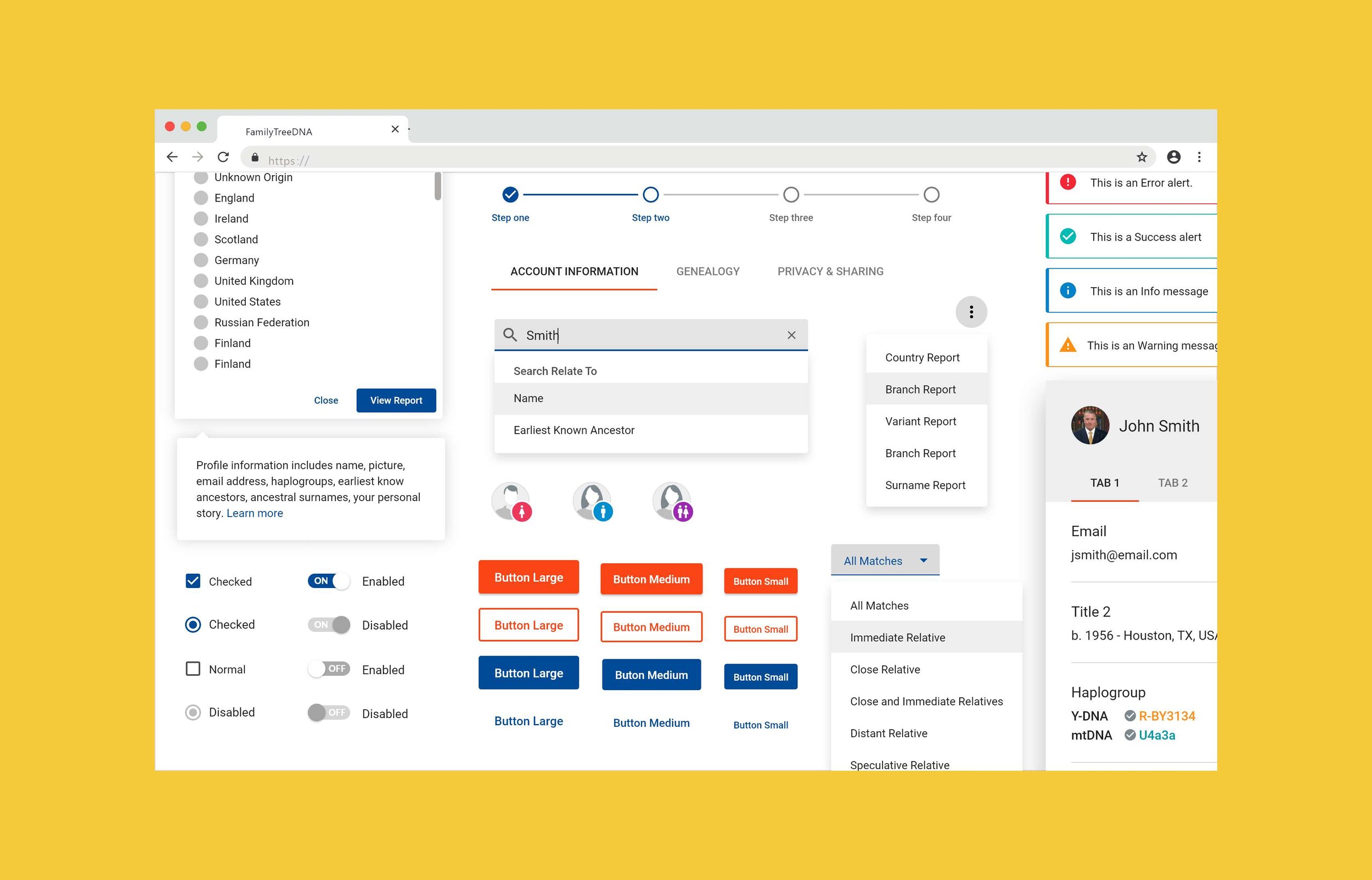
With the analyses of the audit previously made, we decided to focus first on the smallest user interface structures, like buttons, form fields, icons, avatars, color palettes, etc.

Defining buttons, inputs, labels and other small design elements.
After listing most of the base structures, we combined existing and new ones in groups to see how they work together on a page and validate whether those groups worked.
Defining Tree Profile Cards, Steppers, Tabs, and Alert Messages.

Dialogs, Search bar, Tooltips, Nubbins, Paginator, Parental Matching, Advanced Filters
Then, we wired up the groups of components together to build functional blocks.

Components work together in different contexts like Header, Tables, Profile info, and Dialog with multiple types of permissions.
Once we had most of the components working together it was time to see how to use them to build a cohesive experience. Here was where we started seeing the design (templates) coming together with multiple features.
🪄 Results
Breakpoint system
To ensure a consistent and optimized experience across different screen widths (devices), We decided it was time to standardize different breakpoints for current and future UIs.

Mobile | Tablet | Desktop
Wit the help of the dev team we created a reusable set of breakpoint to be use across different apps

Custom breakpoints using Angular Flex-Layout
Angular Material
With most of the UIkit created we decided to use Angular Material as our base CSS framework, the main reasons being:
It’s easier the creation of modular/reusable styles.
It’s highly configurable, allowing us to customize styles for our brand.
It has a complete solution for all our UI needs.
It has options for theming and a responsive flex grid layout.
It comes with directives that make the angular application development process faster and more flexible.
Collaboration library
Once I finished putting most of the components together in the document, I decided it was time to share the library with the other designers; it was beneficial because it helped us make refinements and collaboratively fix inconsistencies.

Shared design systems in Adobe XD
Documentation
“If it’s not documented, it doesn’t exist.”
To help designers, developers, PMS, and other stakeholders deliver expected UIs we decided to start documenting our design system in Confluence.

Using Confluence to document our components
🎯 Conclusion
Benefits
Even though a design system is an ongoing project, we achieved many goals like:
Making the look and feel consistent across different apps.
Build and ship projects 2x faster than we used to.
User Interface kit helped developers to create reusable code across other apps.
Helped copywriters and marketing align the voice and tone of the FamilyTreeDNA brand.
Close the gap between designers and developers.
Prototype and validate concepts 2x times faster.
Start Moving from multiple-page application (MPA) to Single-Page Application (SPA).
Future work
As part of the growth of the design system, there are additional pieces we want to keep improving and exploring based on user needs like:
Incorporate dark mode.
Publish a Storybook of our UI components.
Set up version control.
Keep improving accessibility.